E X H I B I T I O N
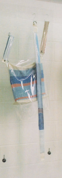
The aim of my exhibition set up was to create a visual image that would be an effective tool for commercial communication whilst maintaining its conceptual appearance. Whilst the accessories are bespoke and limited, I wanted to create a minimal, clean and considered installation that could suggest how the collection could be commercially viable with a luxurious edge, encouraging interaction and communicating a story of how the collection came into existence..
After extensive research into contemporary, visual store designs and the idea of a suspended rail which can be seen floating in the centre of a shop floor creating a minimal yet effortlessly effective look, I went with the idea of suspending wire metal panels, that brought to light the subtle industrial hints that represent the industrial feelings associated with urban life, whilst also offering a militant aesthetic. Suspending these panels and draping the collection against them proved an effective hybrid of a conceptual display and commercially viable space.
Amongst the instillation I provided a visual research book and Lookbook as a navigational tool for the exhibition viewers, aiding a greater understanding of the concept and story behind the collection lending it context.


